Overview
The Problem
Employees needed an easily functioning Human Resources site to locate important documents, upcoming events, and company news. Previously, the site was a conglomerate of elements that were added without a heirarchy. It contained irrelevant information and outdated events that had not been updated in the past year.
The Solution
Based on user research, I reformed the hierarchy and created a number of new resources to replace outdated ones. With the new HR site, employees can easily access their most needed resources, view company news and upcoming events, and access necessary and important documents.
Research
User Research
I initiated meetings with human resources and marketing and asked around the office to get to know my users and what their habits were. My questions focused on:
- What links do they visit the most?
- Why they visited these places?
- What area of the site was least visited?
- What would you like to see on the site?
I summarized the feedback and identified common themes for user motivations, frustrations, and considerations:
- The top most visited links were the phone book and the seating chart;
- The least visited spot on the site was health and wellness page, information had not been updated in the past year;
- It was clear from the feedback that employees wanted a site that was less cluttered.
Personas
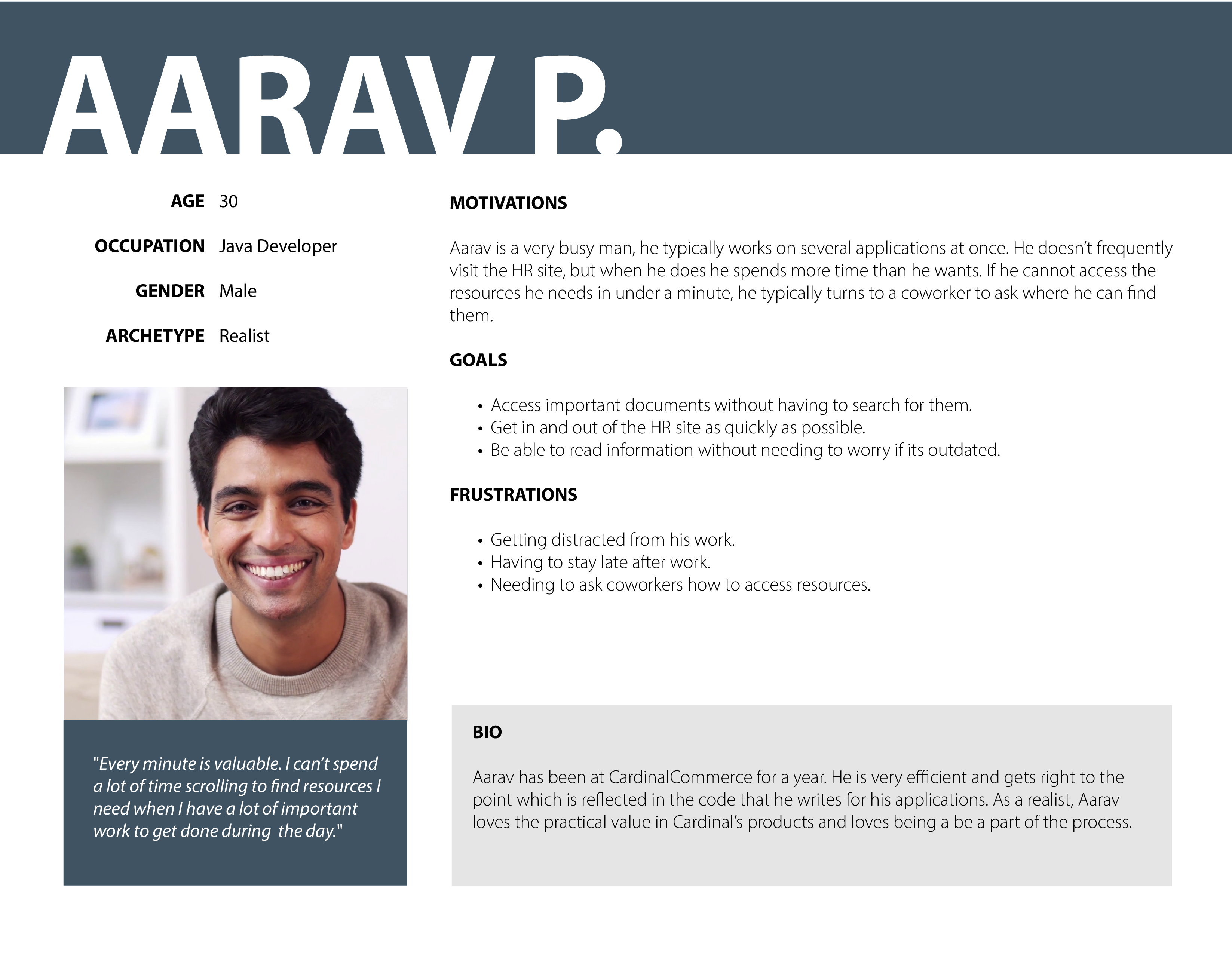
From the information I gathered above I identified three major user groups which I developed into three personas.


User Stories
After compiling a lengthy list of tasks that users would want to accomplish with my product, I prioritized those essential for a minimum viable product (company news, important documentation, phone directory, seating chart) from the nice-to-haves (social media, company events, new hires/promotions).
User Flows & Sitemap
I converted the primary users stories into user flows to visualize how the user would accomplish those stories with the updated site. This took several iterations as the marketing team, HR, and I collaborated on a flow we felt was appropraite and effective.
I followed up my completed user flows with a sitemap to solidify the site’s navigation structure and content hierarchy, and to act as a reference point as I began to design and develop the actual product.

Execution
Paper Prototype

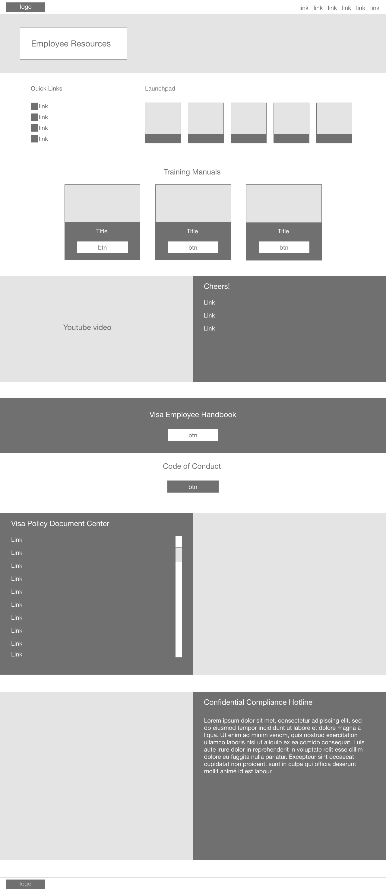
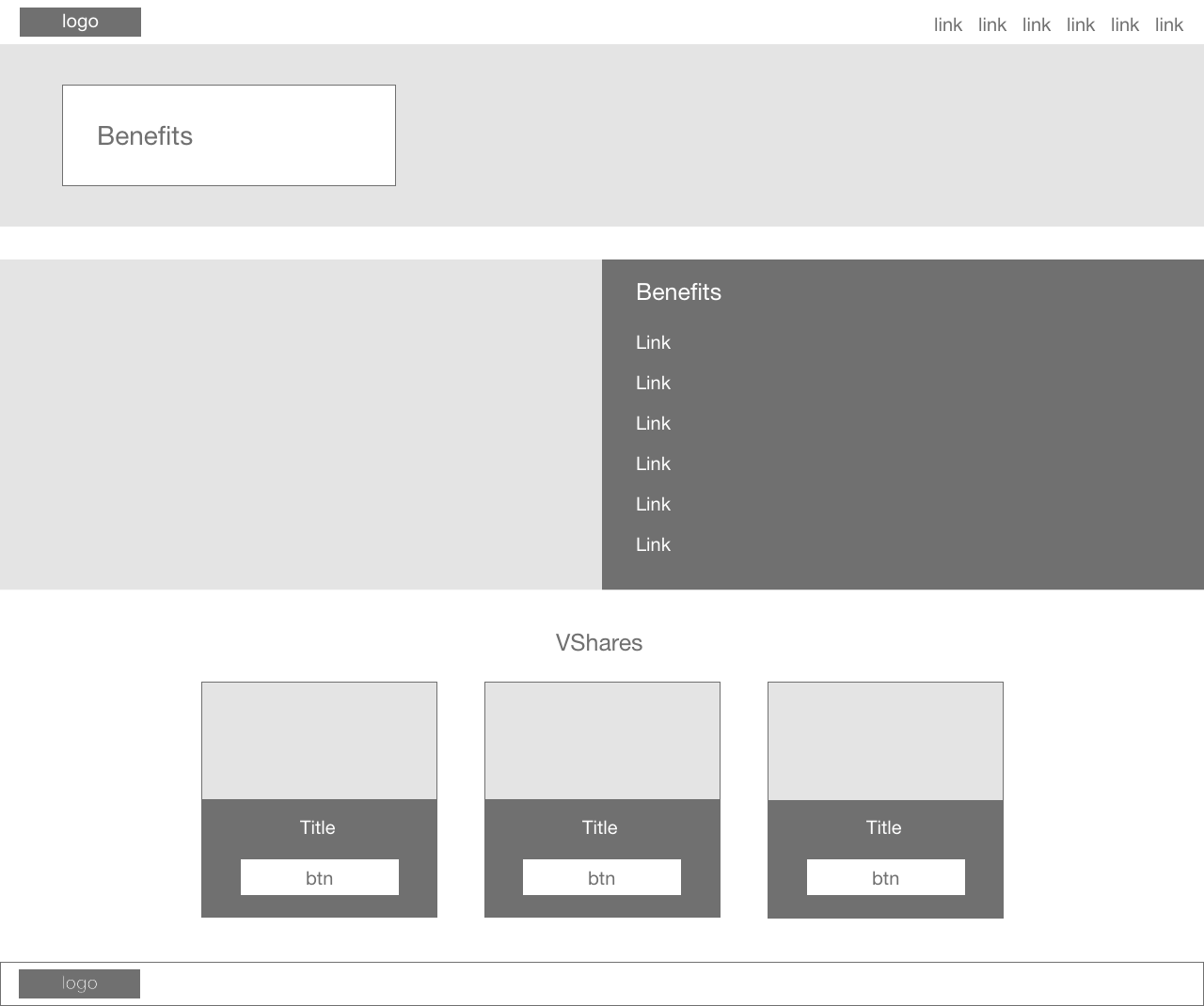
Low Fidelity Wireframes
Below are a few examples of my low fidelity wireframes created in Adobe XD. Click here to view all.

High Fidelity Mockups
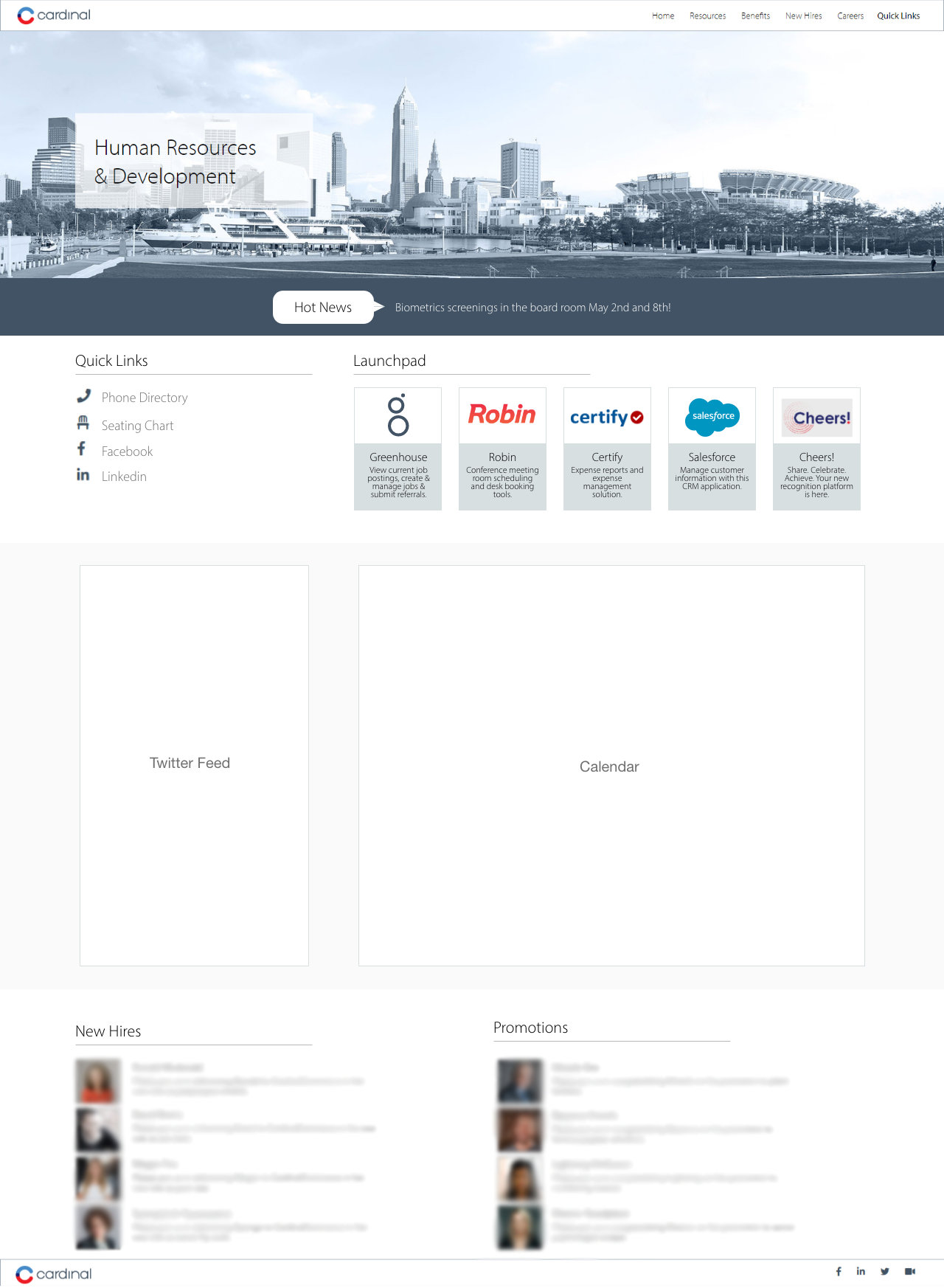
Below are a few examples of my high fidelity mockups created in Adobe XD. Click here to view all.

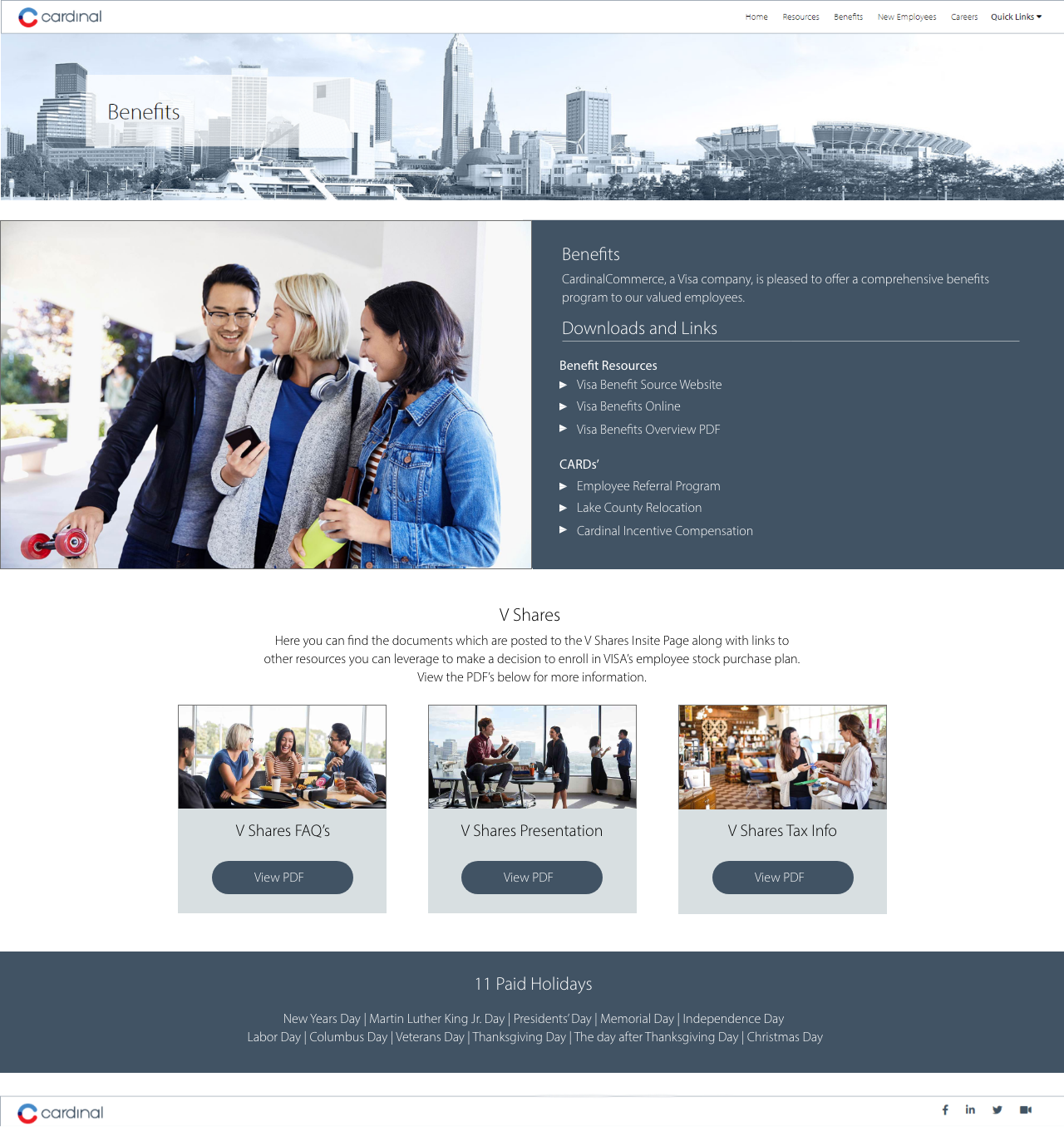
Key Learnings
Redesigning this website challenged me to devise an intuitive solution to the organizational frustrations of users regarding the existing HR site within the limitations of specific business requirements. Working on this project taught me the importance of designing for the user. While I drew upon my own expertise as a UX designer for brainstorming or generating ideas, I learned that not making assumptions about my colleagues' preferences allowed a more efficient design process to reveal invaluable insights. Users loved the fresh approach to the preexisting site and were delighted by the simplicity when the site was published.
I also learned the importance of in-person usability testing, the benefits of cross-team collaboration and the importance of documenting the design process in a manner that stakeholders can understand. This site is internal only, however you can get a closer look at the final coded product by checking out
my Behance.
