Overview
As an evolving and growing business, a challenge Top of Mind faced was maintaining a consistent experience across their rapidly expanding product, Surefire. I created a centralized hub for showcasing Top of Mind's design rules, principles, and frontend components. When creating this style guide, I had three goals in mind: create a living cohesive design language, expedite design and development, and create a trustworthy environment for developers.
The Problem
Mismatched style guides, design rules, and components among different teams led to a lot of confusion as to what our product looks like. There became a very apparent need to have a style guide that could be used and understood by all team members spanning the entire company.
Research
Competitive Analysis
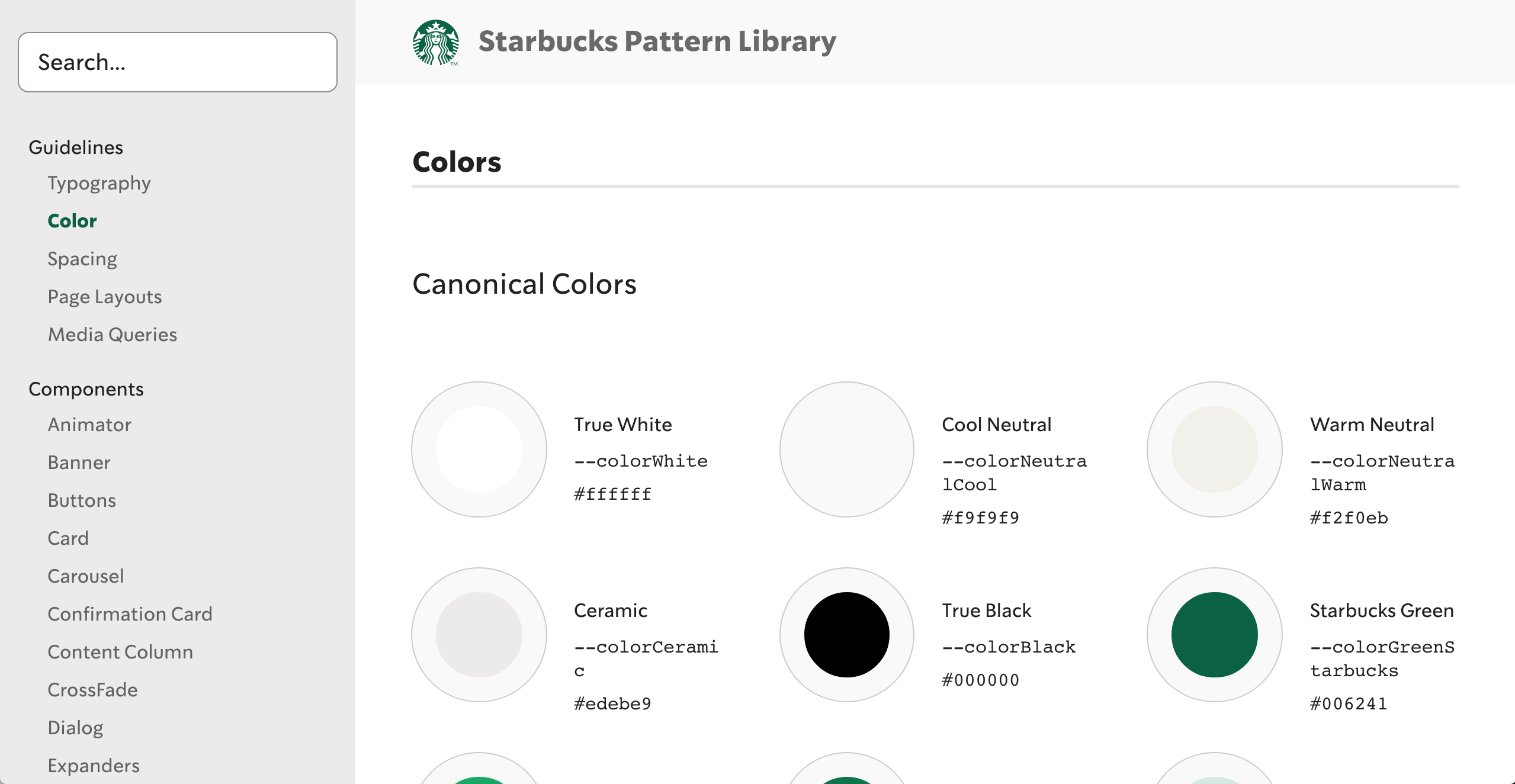
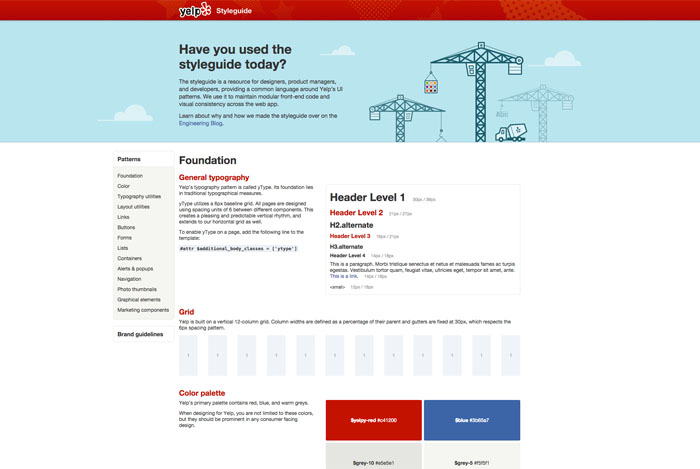
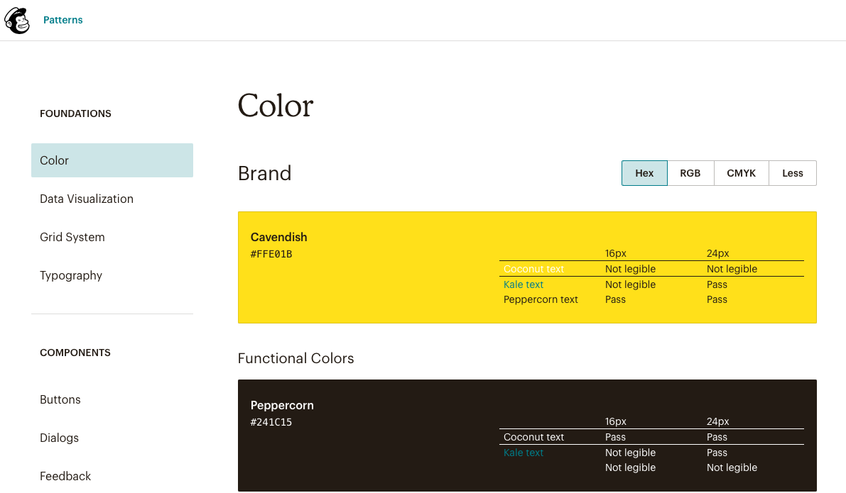
With scattered ideas as to what our product should look like and few cohesive components to work with, creating the style guide and UI kit was a very large undertaking. I explored several different successful style guides online to draw inspiration on what componenets to include, general layout, and what language was used to explain design choices. Three of the biggest sources of inspiration came from Starbucks, Yelp, and Mailchimp.


User Personas & UX Goals
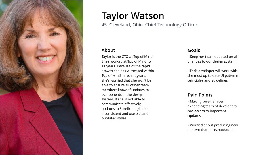
I identified 3 potential users to understand what the style guide needed to accomplish. By understanding my user's goals and pain points, I could design to solve for each.


- Users should be able to access any component in the design system without wondering if it is up to date.
- Designers and developers should be working with the same UI pattersn, principles, and guidelines to maintain cohesion across the teams.
- A single source approach to building out our interface means we can create and iterate faster, and empower front-end developers to implement design changes and deliver features with minimal upfront design work.
Execution
To remain a leader in their industry and continue to build products that delight customers and meet their needs, Top of Mind needed to rethink how they approached product design. By implementing the new style guide and UI kit, Top of Mind prioritizes a unified system that can be understood and implemented by all teams. This understanding across the company ensures they are consistently putting out products that maintain a user-centric mindset and ensure customer satisfaction and retention.
